


What Now? A Question Ain’t Really a Question, if You Know the Answer Too: Part 4B (SEASON FINALE!!!!!!)
“Outside suburbia’s sprawling everywhere. I don’t want to go, baby. New York to east California. There’s a new wave coming, I warn ya”

Some thoughts on communication informed—in part—by life in the pandemic though not necessarily about life in the pandemic and, if I’m being honest, the writing kinda started beforehand anyways. The essay equivalent of a streaming mini-series in four parts. If you missed it, read Part 01, Part 02 & Part 03 here.
Can You Take a Message?
It is most important to know the network through which your signal will travel and to maintain control over the levers that orient how it is delivered—medium, material, aesthetics, strategy, style, substrate, audience. This is the study and fundamental task of graphic design. This is not to say the tactics are always ones of clarity and order. It might require metaphor or deliberate obfuscation. To formalize abstract thought in a way that it can be transferred from one person to another requires not only saying the words, it needs to convey the feeling, the associations, to replicate the act of thinking itself. Because what is art if not a basic attempt to communicate the inexplicable?
A piece I saw in the 2019 Whitney Biennial by Christine Sun Kim, titled “Degrees of My Deaf Rage in The Art World” consisted of hand drawn charcoal pie charts that quantify the ways art institutions marginalized her. On the bottom right, one is labeled “MUSEUMS WITH ZERO DEAF PROGRAMMING” above a completely filled circle. This one clearly makes her the most angry. I sympathize with her frustration, but the result feels like getting a sticky note that says clean the fridge. As a piece of art it remains cautiously literal. By doing so, it limits its capacity to tell you anything.
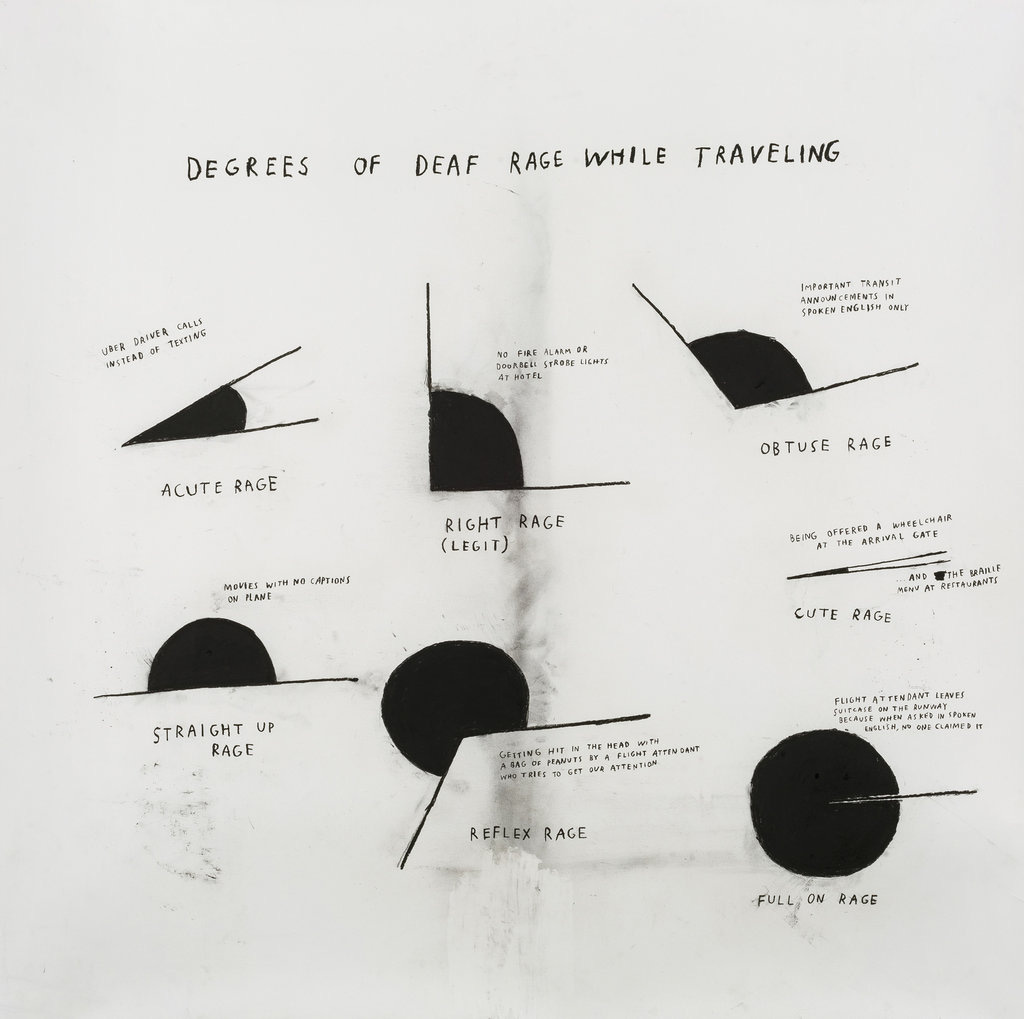
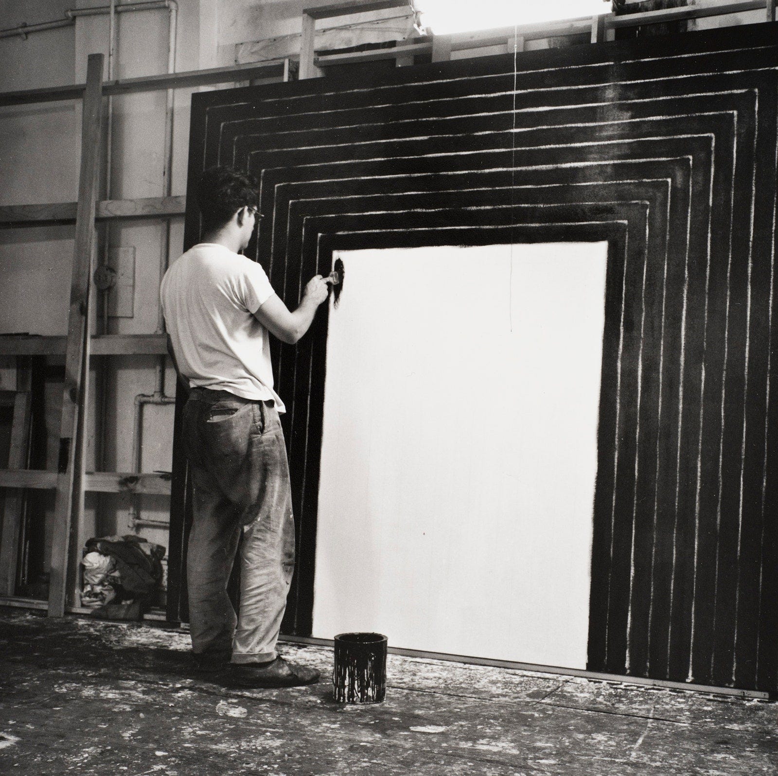
Top: Degrees of My Deaf Rage in The Art World by Christine Sun Kim. Bottom Frank Stella working on his Black Paintings
This reminded me of an opposite approach that uses the same black and white. I’m thinking of Frank Stella’s original Black Paintings. Consider the detailed relationship between the standard house painter brush, the width of which Stella used as the unit of measurement for his canvases so that the strokes fit perfectly. The pinstripe negative space between the parallel black stripes create an infinite variety of form by dint of the inherent variability of thick paint applied by an inexact tool. Stella uses the behaviors of the material to create a push and pull between perfection and chaos, an infinitely renewable and sublime experience. These paintings contain more truth than any amount of words could possibly convey.
Slacker
Of course it came up first in Skype therapy, with its visual and aural glitch, this idea that my pathological and difficult relationship to communication may have shaped my interest in its study. I suspect the degradation of our sessions from in-person to screen made it more difficult for my therapist to pay attention to early warning signs that I was possibly unravelling, as he has done in the past. My romantic relationship got further tangled in Laing’s knots. Eventually the noise overpowered the signal and the relay of miscommunication had ultimately dire and life altering consequences.
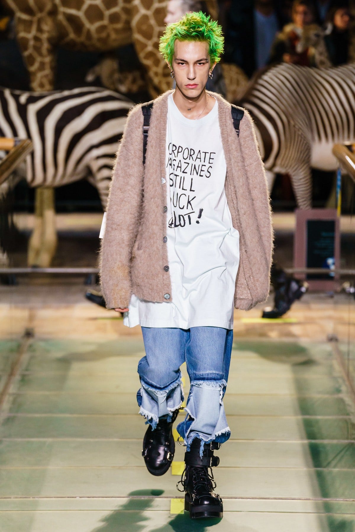
Vetements A/W '19 if you don’t know it look up the reference but you should know it
My completely unemotional 2012 essay held a subconscious pain, even as I resisted my teachers’ mandate to explore my identity through graphic design. I think my distaste for that approach is the same as my relationship to the trauma industrial complex now splayed out on every home page. Intimate details of violent sex is presented as sympathy, but the deliberate misuse of progressive linguistic codes mask the audience’s titillation that monetizes the subject’s suffering. This comes back to the late Mark Fisher’s Capitalist Realism, which says that no matter what you do to resist, you are still participating in and contributing to the system you are fighting. This is where we have to be vigilant around how messages can be disguised and ultimately used for purposes anathema to their intentions. He talks about this in relationship to the work and life of Kurt Cobain. “Cobain knew he was just another piece of spectacle, that nothing runs better on MTV than a protest against MTV, knew that his every move was a cliché scripted in advance, knew that even realizing it is a cliché.”
Self-Portrait from Memory
In our current isolated condition we seem to be stuck in a lived skeuomorphism where we continue to try to simulate real life. A friend told me about a virtual tour of a Warhol exhibition in a museum. I thought about what Warhol would even make of the fetishization of his old work if he were alive now. He made work from an engine that responded specifically to the material conditions and images of his time, when screen printing was a viable commercial method of reproduction. Would he want some ersatz viewing of works that don’t even feel relevant? And I started thinking about his drivers—what were the levers of the networks he manipulated, and how would they apply now?
Around the same time, my then girlfriend and I walked her dog one morning. We were down below Grand Street along the Williamsburg water front and passed a series of condos who’s ground floor plate glass windows were still covered with banners announcing this or that business coming soon. We wondered with this indefinite pandemic shutdown, which window dressing would keep its promise. We saw the slapdash way in which the, infamous and ever-expanding, legacy Bushwick pizza restaurant Roberta’s translated their brand symbolism and ideology to one of these new spaces. It already looked like an airport food stand, a far cry from the labyrinthian tin hut in which the original made waves. They could not figure out how to scale their authenticity. And I mused about brands that have managed to keep a core audience and ethic that stays with them and serves as an ambassador to newcomers as they grow. This somehow resolved around the idea that to properly study Warhol is to think about the underlying mechanisms at play, not necessarily any specific visual signifier, process or medium. So too with Roberta’s, the logo and some vague cartoon reference to brick are what seem to be the right symbols, but, in their context as construction wraps, fail to convey any recognizable essence beyond banality. The question really is, how does a Roberta’s ethic apply to this surface? The answer might not look exactly like the original. It might not be able to. This, if nothing else written so far, I think is a key takeaway about what it takes to build a brand.
Finally, in a loop back around, we arrived at the idea that Warhol’s practice was essentially about portraiture. In thinking about both where he ended up—literally doing a portrait series of celebrities and patrons for cash to finance his films and start Interview Magazine—this made sense. Then I thought about his first work, the painted Campbell soup cans. They are often read as pure pop, known widely as the radical act Warhol took in elevating a supermarket product into art, but when he talked about it, Warhol was nostalgic for his personal relationship to Campbell’s soup and how it reminded him of being a child in his mother’s kitchen. These were self-portraits spawned from a childhood memory in the way Proust’s madeleine became the seven volumes of Remembrances of Things Past.

The invitation to the first show of Warhols Campbell’s soup paintings at the Ferus Gallery show.
Fundamentally, Warhol’s project was not pop, it was about the self in relation to the networks in which it lived and his relationship to personae—his own, the superstars he created, his fascination with film icons. I think about all of this and how Interview, with its seductive photography and candid conversations, focused on celebrity, it played with the line between their constructed and candid self-image. As a magazine it can actually enter a popular distribution network, not just make reference to one and therefore have the potential for an intimate relationship with a large number of readers. This was his logical next step in portraiture.
Page from the 2018 redesign of Interview Magazine. Edited in chief Nick Haramis, creative direction Richard Turley, Art direction Kurt Woerpel, Photography Bruno Staub.
And like so many editorial properties, whose talent and expertise, if properly structured, could easily start to put their writing and art direction skills towards commercial projects—Natasha Stagg worked as a strategist at 2×4—he’d probably have split Interview off into a creative studio as well. He would be thinking about how to distort and manipulate, to control the parameters of the noise in relation to the signal, to build complex narratives and to see them play out on multiple platforms all at once. He could satisfy his desire to create and portray identity and, where his films failed, he could actually re-enter his ideas into the consumer marketplace. I guess that’s what I’m trying to do. To build fictions and fantasies that circumvent language by living in the imagination. This feels like a good way to approach our current condition—which truly leaves me speechless.
Parts 01–04 will be archived on hgtv420.substack.com. And thats it for this one. Not coming out in the letter, but posting soon will be an edited version of the essay in one piece :)